
A customizable CRM dashboard: pick the cards, arrange them, and it follows you
Groundbase's dashboard is thirteen cards you choose, move and resize yourself — pipeline, tasks, money owed, unread texts, campaigns, your Twilio balance. The layout saves to your account and follows you between computers. Here's what each card shows and how arranging works.
The Groundbase dashboard is a grid of cards you choose, move and resize yourself — thirteen of them, covering your pipeline, today's tasks, who owes you money, unread texts, campaigns and your Twilio balance. Click Customize, arrange them on the dashboard itself, and the layout saves to your account, so it's the same on every computer you sign in on and in the desktop app.
The idea is simple: the first screen you see each morning should be the one that matters for your business, not the one that mattered to whoever designed the software.
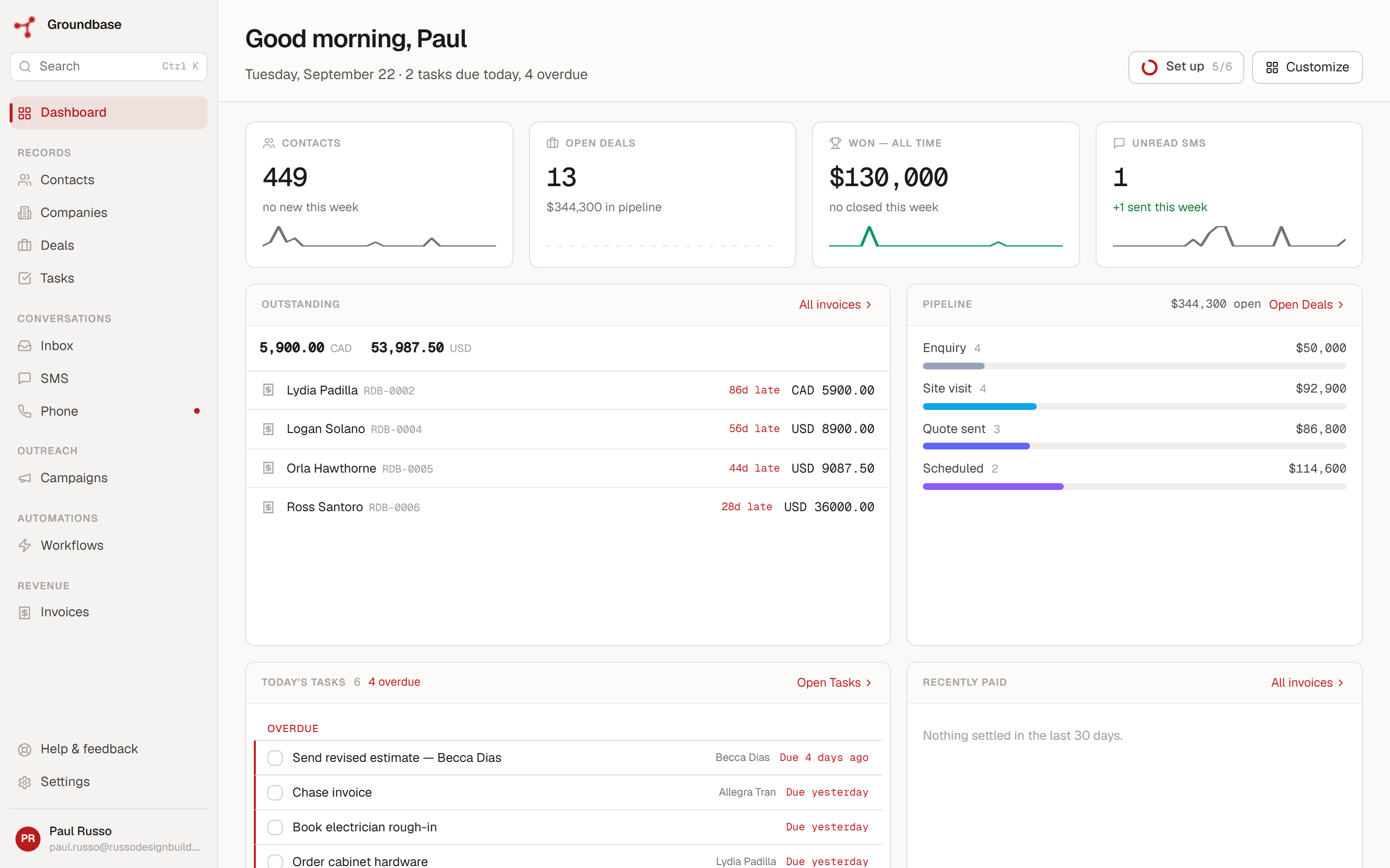
The thirteen cards
Every card is available on every account — none is tied to a plan.
| Card | What it shows |
|---|---|
| Contacts | How many you have, with a 30-day trend |
| Open deals | How many, and what's in the pipeline |
| Won | Everything closed won, all time |
| Unread SMS | Unread texts, and how many you've sent this week |
| Today's tasks | What's due today, with anything overdue called out first |
| Pipeline | Open deal value by stage, as a bar and a breakdown |
| Recent activity | The latest things that happened across your account |
| Outstanding invoices | Who owes you, overdue first, with the total in each currency |
| Recently paid | Money in over the last 30 days |
| Campaigns | Your most recent sends and how they performed |
| Twilio balance | Your Twilio credit, so you see it before a send fails |
| Needs attention | Overdue tasks, invoices past due, and deals that have gone quiet |
| Quick actions | Start a contact, deal, invoice or task without leaving the dashboard |
A new account starts with a sensible default — the four number tiles, then today's tasks, the pipeline, recent activity, needs attention and quick actions — and nothing changes until you change it.
Arranging it
Click Customize and the dashboard goes into edit mode. Every card gets a remove button and a resize handle in its bottom-right corner, and the controls you need appear at the top.
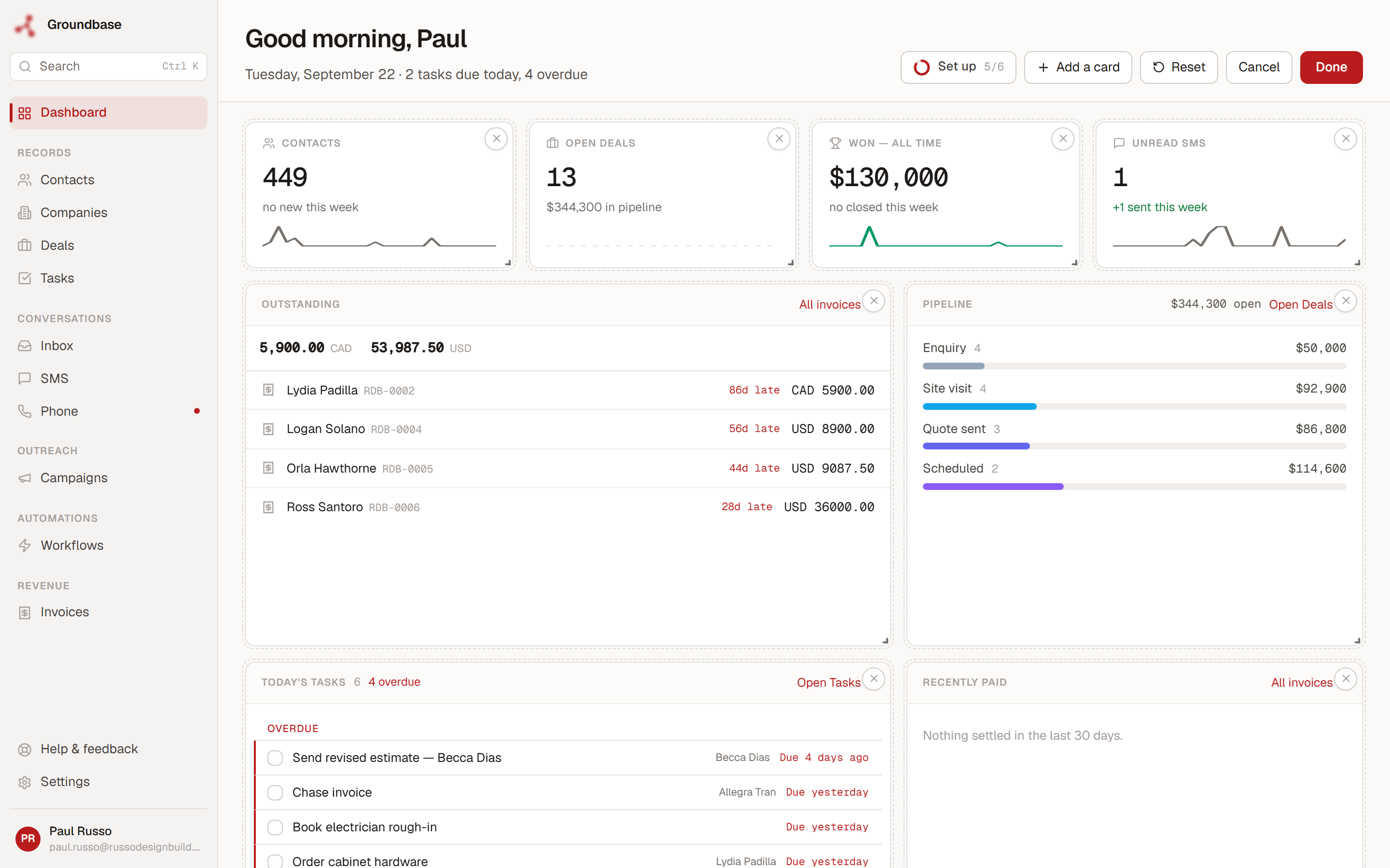
- Drag a card to move it. The cards around it make room.
- Drag the corner to resize it — a wide pipeline, a tall task list, a small balance tile.
- Click the × to remove a card. It goes back into the tray, so nothing is lost.
- Add a card opens a tray of everything not yet on your dashboard, each with a one-line description.
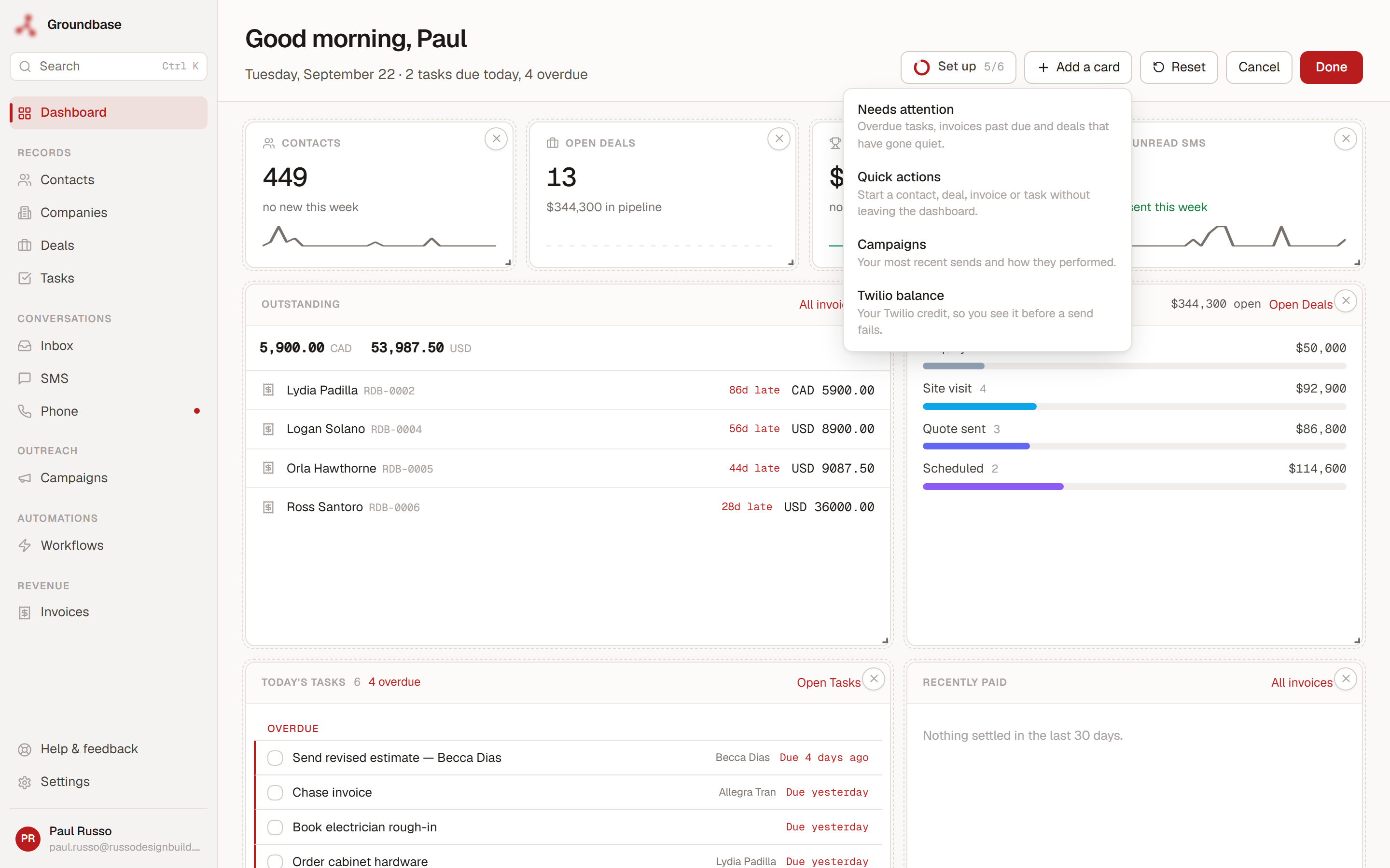
Then Done saves it, Cancel throws away what you changed, and Reset puts the default back.
Arranging happens on the dashboard rather than on a settings page for one reason: you can't sensibly decide how big a card should be without seeing it at that size.
A few layouts that make sense
There's no right arrangement, which is the point. But some patterns come up:
- Money first. Outstanding invoices and recently paid across the top, for anyone who bills in more than one currency or chases payment often. Invoicing inside your CRM is what fills those cards.
- Today first. Today's tasks full width and needs attention beside it, for the days that are about getting through a list.
- Outreach first. Unread SMS, campaigns and the Twilio balance together, for anyone running campaigns — the balance card exists so a top-up isn't the reason a send fails.
It follows you
The layout saves to your account rather than your browser. Arrange it on your laptop, and the desktop app and any other computer you sign in on show the same thing.
The Android app is different on purpose. A phone screen doesn't suit a grid of thirteen cards, so the mobile app has its own home screen, built for the four-second glance rather than the morning review, and your dashboard layout doesn't change it.
What it doesn't do
- Cards show fixed views. You choose which cards appear, where and how big — not what each one calculates. There's no choosing a date range or a filter per card.
- It isn't a report builder. No custom charts, no formulas. If you need to build your own reports, a spreadsheet or a BI tool does that better.
- There's one dashboard. Groundbase is built for one person, so there are no shared or per-teammate dashboards.
Where it fits
Groundbase is a CRM for one-person businesses that sends email and texts through your own accounts and connects to the AI assistant you already use. The dashboard is on the same single plan as everything else. The Dashboard help article covers every card and control in detail.
And if you'd rather ask than look — "what's my pipeline worth?", "who owes me money?" — that works too, from the AI assistant you already use: ten real things you can ask a CRM connected to Claude.
Arranged your dashboard in a way I didn't expect? I'd like to see it: blog-dashboard@groundbasecrm.com — I read every one.
Built by a solo dev. Try it.
Start your 14-day trial →More from the Pipeline
Multiple email accounts in one CRM: how Groundbase decides which one sends
You can connect as many Gmail, Outlook or other IMAP/SMTP mailboxes to Groundbase as you like and read them…
Email and text campaigns in your CRM: drips, daily limits, and follow-ups that stop when they reply
Groundbase campaigns send email and texts to a segment of your contacts — one-off blasts or multi-step drip…
Why I removed Sequences from Groundbase (and what replaced them)
On 14 September I deleted a whole feature rather than keep improving it. Groundbase had three ways to send …
Per-seat pricing: what a one-person business actually pays (checked September 2026)
Per-seat pricing should mean one person pays for one seat. Several CRMs charge a solo operator for more — s…